
Introduction
Every AWS environment accumulates complexity faster than its documentation keeps up. A new VPC here, a Transit Gateway there, a cross-account RDS cluster added during a late-night incident — and six months later, nobody knows exactly what connects to what.
AWS architecture diagrams solve real operational problems. During a security audit, an accurate diagram lets you walk through your attack surface in minutes instead of reverse-engineering it from the console. When a new engineer joins, a network diagram cuts onboarding time from weeks to days. During an incident, having the topology in front of the team lets everyone reason about blast radius without guessing. For SOC 2 or ISO 27001 reviews, auditors expect network documentation — not a verbal description of what you think is deployed.
The core problem is that most diagrams are stale the moment they're saved. Infrastructure changes outpace documentation. This guide covers what a complete AWS architecture diagram needs to show, the four main approaches to producing one, and how to choose the right tool for your situation.
What a complete AWS architecture diagram should show
A diagram is only useful if it captures the information people actually need. Here's what belongs in a complete AWS network diagram and why each element matters.
Network topology
VPCs and subnets are the foundation. Separate public from private subnets — this immediately communicates which resources are internet-reachable. Group subnets by availability zone to show how your workloads distribute across failure domains.
Internet Gateways and NAT Gateways tell you which paths exist to the public internet. A missing NAT Gateway in a routing path explains why a private EC2 instance can't reach external dependencies. An unexpected Internet Gateway attachment is a security finding.
VPC endpoints are often missing from hand-drawn diagrams but matter significantly for security and cost. An S3 VPC endpoint means traffic stays off the public internet. Without it on the diagram, engineers may not realize traffic is egressing through NAT.
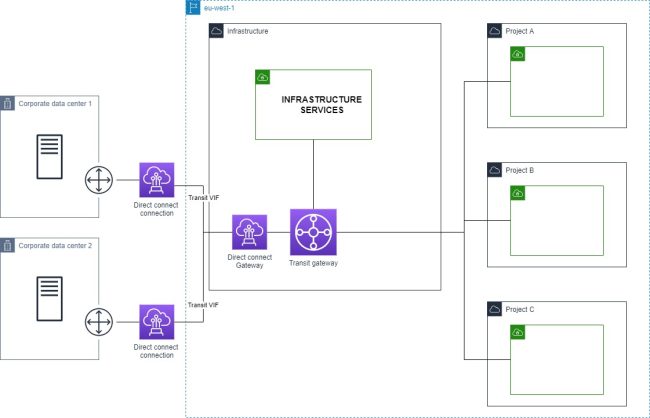
Transit Gateways and VPC peering connections show how your accounts and VPCs talk to each other. In a multi-account setup, this is the most complex part of the diagram and the easiest to get wrong manually.
Compute and services
EC2 instances, ECS clusters, and EKS nodes should appear in the subnets where they run. EKS deserves special attention — nodes live in your VPCs, but the control plane endpoint may be public or private, which has security implications.
Lambda functions are often omitted because they feel "serverless," but they matter when VPC-attached. A Lambda in a private subnet routes through that subnet's NAT Gateway — which affects both egress cost and connectivity troubleshooting.
RDS, ElastiCache, and DynamoDB need to be shown with their subnet groups and the security groups controlling access. Database connectivity issues are dramatically easier to diagnose when you can trace the security group path from application to data store.
Load balancers (ALB and NLB) should show which subnets they span and whether they're internet-facing or internal. An internal ALB in a public subnet is an architectural smell worth flagging.
API Gateway endpoints — regional, edge-optimized, or private — determine how external traffic enters your application. Private API Gateway with a VPC endpoint is a completely different architecture than a public regional endpoint.
Security and access control
Security groups and their rules are often the difference between understanding and confusion. At minimum, show which security groups are attached to which resources. Ideally, trace the inbound/outbound rules that matter for connectivity — source security group references are especially useful.
Cross-account connections — whether through Transit Gateway, VPC peering, RAM (Resource Access Manager), or PrivateLink — are invisible without a diagram that spans account boundaries. These are also where IAM trust policies and resource policies intersect with network controls.
Approach 1: Manual diagramming
Tools: draw.io (diagrams.net), Lucidchart, Miro, Cloudcraft
How it works: You open a canvas, add AWS-shaped icons from a shape library, and draw connections by hand. Both draw.io and Lucidchart ship AWS icon sets that match the official AWS icon library.
Pros:
- Complete control over what appears and how it's arranged
- No AWS access required — useful for documenting architecture you don't yet control
- Good for producing clean, presentation-quality diagrams where visual layout matters
Cons:
- Stale the moment your infrastructure changes — and infrastructure always changes
- Doesn't scale past roughly 20–30 resources before becoming unmanageable
- Relies entirely on the person drawing having accurate knowledge of the environment
- High ongoing maintenance burden: every infra change requires a manual diagram update
When it makes sense: One-time presentations, architecture proposals before anything is built, early-stage environments with fewer than a dozen resources that genuinely don't change often.
Approach 2: IaC-generated diagrams
Tools: cfn-diagram (CloudFormation), cdk-dia (CDK), Blast Radius / terraform-visual (Terraform)
How it works: These tools parse your infrastructure-as-code files and render a dependency graph. They work from static files, not from your live AWS account.
# CloudFormation: generate a diagram from a template
npx cfn-diagram visualize --template template.yaml

# CDK: generate a diagram from a CDK app
npx cdk-dia --stacks MyStack

# Terraform: start the Blast Radius web server
blast-radius --serve .
Pros:
- Tied to your IaC source of truth, so changes to infrastructure-as-code are reflected in the diagram
- No live AWS credentials required at diagram generation time
- Works in CI pipelines — generate a diagram on every PR
Cons:
- Shows planned state, not deployed state. If someone changed a security group in the console, your IaC diagram won't show it
- Dependency graphs (resource A depends on resource B) are not the same as network topology (resource A routes to resource B through subnet C via this security group). The graphs IaC tools generate are useful for understanding deployment order and resource relationships, but they don't answer "can this Lambda reach this RDS instance?"
- Resources created outside IaC — manual console changes, resources from other teams — are invisible
- Terraform dependency graphs in particular become visually unusable at scale
When it makes sense: Teams with high IaC discipline who want to catch configuration drift at PR time. Useful as a complement to live-discovery tooling, not a replacement.
Approach 3: Auto-discovery from live AWS
How it works: The tool connects to your AWS account using a read-only IAM role, calls the AWS APIs (EC2, ECS, RDS, VPC, etc.), enumerates your actual deployed resources, and builds a network topology graph from the API responses.
This is the only approach that reflects what's actually running — not what's in code, not what someone drew six months ago.
IAM setup (cross-account read-only role):
{
  "Version": "2012-10-17",
  "Statement": [
    {
      "Effect": "Allow",
      "Action": [
        "ec2:Describe*",
        "elasticloadbalancing:Describe*",
        "rds:Describe*",
        "ecs:Describe*",
        "ecs:List*",
        "lambda:List*",
        "lambda:GetFunction"
      ],
      "Resource": "*"
    }
  ]
}
Pros:
- Reflects actual deployed state at the time of generation
- Captures infrastructure drift — resources that exist in AWS but not in IaC
- Covers all accounts and regions you connect, including cross-account topology
- Generates in seconds, not hours
Cons:
- Requires read-only IAM access — appropriate for any internal tooling, but a consideration for compliance-sensitive environments
- SaaS tools in this space typically have subscription costs
- Shows current state only — no historical snapshots unless the tool supports them
Tools in this space:
- VizCon — AWS-native, connects via cross-account IAM role, generates network diagrams on demand in around 30 seconds. Covers multi-account environments with a global network view. Purpose-built for AWS (not a generic multi-cloud tool). VizCon generates a diagram that includes VPCs, subnets, security groups, load balancers, Transit Gateways, and service connectivity without manual configuration.
- hava.io — multi-cloud (AWS, Azure, GCP), automated diagrams, longer history of enterprise use
- CloudMapper — open-source Python tool, generates HTML network maps from AWS API calls. No longer actively maintained (last meaningful update 2022); still works for basic use cases but lacks modern resource types
Approach 4: AWS-native tools
AWS ships a few built-in visualization tools that are worth knowing about, with significant caveats.
CloudFormation Designer renders a visual view of a CloudFormation template. It's useful for understanding what a template deploys but only covers resources managed by that specific stack.
Systems Manager Application Manager groups resources by application and shows their relationships. Useful for application-level views, not network topology.
VPC Reachability Analyzer is different — it doesn't draw diagrams but does analyze whether a specific path between two resources is reachable, tracing through security groups, NACLs, and routing tables. Highly useful for debugging, but not a documentation tool.
Limitations across all AWS-native tools:
- Account-scoped by default — no cross-account view without significant additional configuration
- Limited to resources in CloudFormation stacks (for CloudFormation Designer)
- Not designed for exporting or sharing as documentation
When to use: Quick sanity checks on a single account, or when you need to debug a specific connectivity path with Reachability Analyzer.
Choosing the right approach
| Team size | Infra complexity | Recommended approach |
|---|---|---|
| 1–5 engineers | 1 AWS account, <50 resources | Manual or IaC-generated |
| 5–20 engineers | 2–5 accounts, mixed IaC | Auto-discovery tool |
| 20+ engineers | 10+ accounts, multiple regions | Auto-discovery + IaC diagrams in CI |
The breakpoint is roughly where you stop being able to hold the entire infrastructure topology in your head. For a three-person startup with one account and twenty resources, a draw.io diagram updated once a quarter is fine. For a team managing five accounts across two regions, manual diagramming is technically possible but practically never happens — which means documentation rots until it's wrong enough to cause problems.
Multi-account environments hit the wall fastest. VPC peering and Transit Gateway connections span account boundaries in ways that no single-account tool can represent, and manually tracking which account's VPC peers to which is error-prone at scale.
Integrating architecture diagrams into your workflow
A diagram that lives in a Confluence page nobody reads isn't useful. Here's how teams actually use cloud architecture diagrams:
Sprint planning: Pull up the current-state diagram before designing infrastructure changes. It takes thirty seconds with an auto-discovery tool, and it prevents a class of "I didn't realize that route table would affect this subnet" mistakes.
PR reviews: For infrastructure changes, include a before-and-after diagram screenshot in the PR description. Reviewers can see exactly what's changing in the topology, not just what lines of Terraform changed.
Incident response: During an outage, have the architecture diagram open immediately. Tracing blast radius — "this RDS instance is in the same subnet as these five services" — is visual work that goes much faster with a diagram than with console navigation.
Onboarding: Replace the two-hour "infrastructure tour" verbal briefing with a live diagram walkthrough. New engineers can explore the topology themselves and ask specific questions instead of trying to mentally build a map from a spoken description.
Compliance audits: SOC 2 Type II and ISO 27001 both require network documentation. An automatically generated, on-demand diagram is more defensible as evidence than a manually maintained Visio file that may be months out of date. Auditors increasingly ask about the process for keeping diagrams current — auto-discovery gives a clear answer.
Conclusion
The approach that fits your team depends on where you sit on the complexity curve.
Manual diagrams work for small, stable environments where someone will actually maintain them — but that's a narrower set of situations than most teams admit.
IaC-generated diagrams are the right complement if you have high IaC discipline and want topology visibility in your CI pipeline. They don't replace live-state diagrams; they add a planned-state perspective.
Auto-discovery is the only approach that scales and stays accurate without ongoing manual effort. For teams managing more than a handful of AWS accounts or resources, it's the only method where the diagram is still useful six months after you generate it.
VizCon is built specifically for this use case — connecting to AWS via a read-only cross-account role and generating accurate network diagrams on demand, without manual maintenance overhead.